Giv serves IDD care agencies managing dozens of staff across shifts, clients, and compliance layer schedules. In a system like this, getting a new staff member into the system and giving them the right access should be straightforward.
In reality, the setup flow was a fragmented bottleneck, and the data access controls were dangerously rigid.
I redesigned two deeply interconnected user experiences focusing on restructuring how agencies bring their staff into Giv and control exactly what data each person can access based on their real job functions.
When a new staff joined a caregiving agency on Giv, their welcome looked like this:An admin entered their name and email. The staff member then received an email containing a long agency code which is a unique string of characters tied to their agency because Giv is a multi-tenant platform. They had to download the Giv app, open it, and manually enter the code to get access.
This causes unnecessary drop-off. Support tickets piled up, and admins had no visibility into whether an invite had even been actioned.
On the permissions side, access control didn't reflect the real organizational structures of agencies handling sensitive health-related client information. The platform had a basic list of toggles—one per major platform area to turn access on or off. That was the entire access model for organizations managing dozens of staff across complex, multi-role caregiving operations. No way to add more granular control

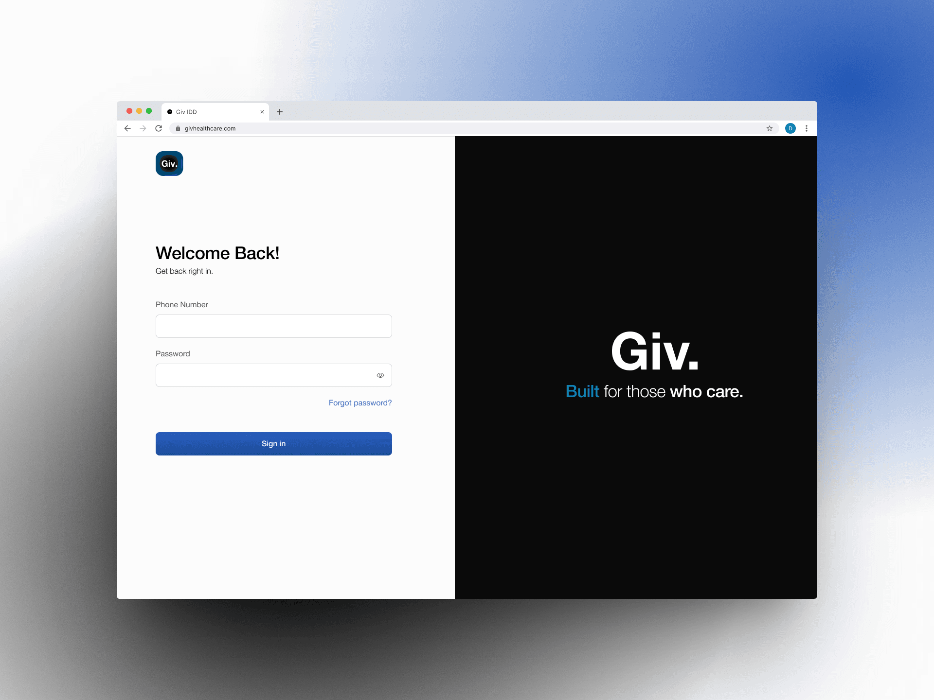
I initially designed a sleek, modern web login screen but It didn't fly.
During evaluation, the feedback gotten from stakeholders made me realized that for our specific IDD end user base and varied caregiver demographics, it risked making users feel excluded .
This shifted the direction to a simpler, more inclusive approach.

Initial design
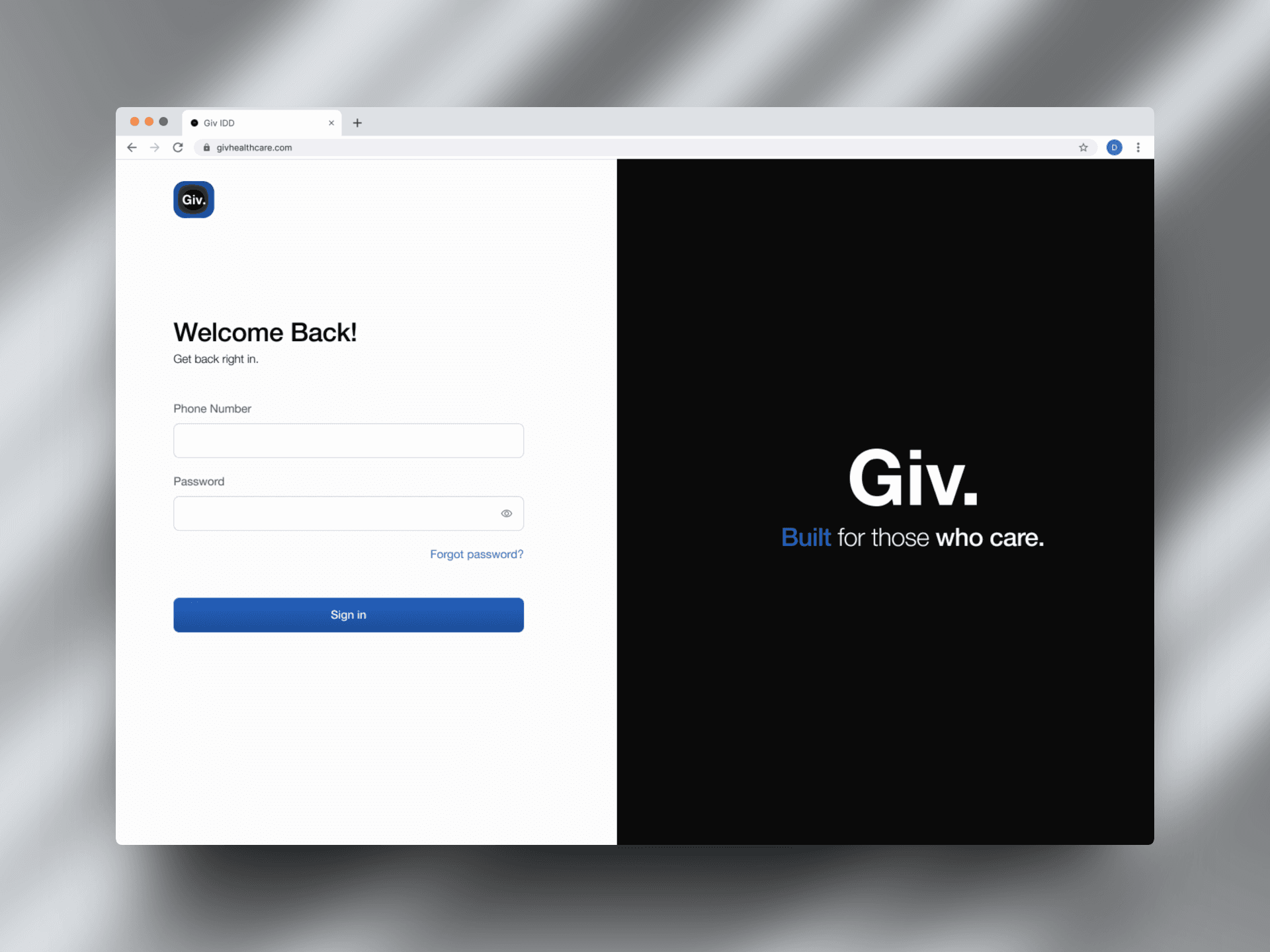
Final design
The code is not just a user headache, it was a wrong mental model. so i replaced it with a clear CTA "Join now" that redirects staff directly into the setup flow.
The email template was redesigned alongside the product flow. The email is the first thing a new staff member sees when they get added . it needed to match the clarity of the new experience, not undermine it.
I initially tied permissions directly to individual roles, with granular view and edit controls which was a real step forward. But engineering flagged that while this works, it could limit adaptability for different organizational structures and also cause duplication in the database because different roles may require similar sets of permissions.
For better scalability, We decided that permission should be tied to access level . Admins can use predefined access levels or create custom ones, making role creation as simple as naming a role and assigning an access level.
User feedback also revealed that some staff wear multiple hats. To support this, every staff member gets Caregiver App access by default, while admins can assign additional role based on their responsibilities.
Access management doesn't stop when a staff member is onboarded.
I designed the experience to support ongoing changes by allowing admins to edit role details, select new access levels, and reassign staff when responsibilities change.
IMPACT & LEARNING
The redesign led to a 70% reduction in support tickets related to staff access and also strengthened the platform's compliance with US healthcare data regulations by giving agencies tighter control over who could access sensitive client information.
This project taught me the true value of early engineering alignment. This alignment proved that great enterprise design isn't just about interface layout, it is about deeply understanding database architecture and product scalability.


LET'S GET IN TOUCH
Have a project idea? I am here to help!